 This website is not yet available on mobile.
I invite you to return from a computer for a better experience.
This website is not yet available on mobile.
I invite you to return from a computer for a better experience.
Omodaka is a project I created to bring serenity and tranquility to those seeking refuge from the chaos of everyday life. My approach is based on the belief that calmness is essential to mental and emotional well-being.
The word Omodaka comes from Japanese (オモダカ), where it refers to a water plant known as 'arrowhead' (Sagittaria trifolia in Latin). This plant, often found in peaceful environments like ponds and rivers, symbolizes tranquility and the purity of nature. The Omodaka project draws inspiration from landscapes around the world, capturing the essence of different places through unique fragrances.
Each scent reflects the atmosphere and emotions evoked by these regions, offering an immersive sensory experience. At Omodaka, each fragrance is created to take you on a calming and sensory journey, allowing you to reconnect with yourself and nature through the scent of these inspiring landscapes.
"A journey of a thousand miles begins with a single step." — Lao Tzu
Omodaka is a personal home-fragrance brand project, born from a simple idea: offering a quiet refuge to those worn down by everyday life. Everything had to be created, from the name to the packaging, with no brief and no existing framework.
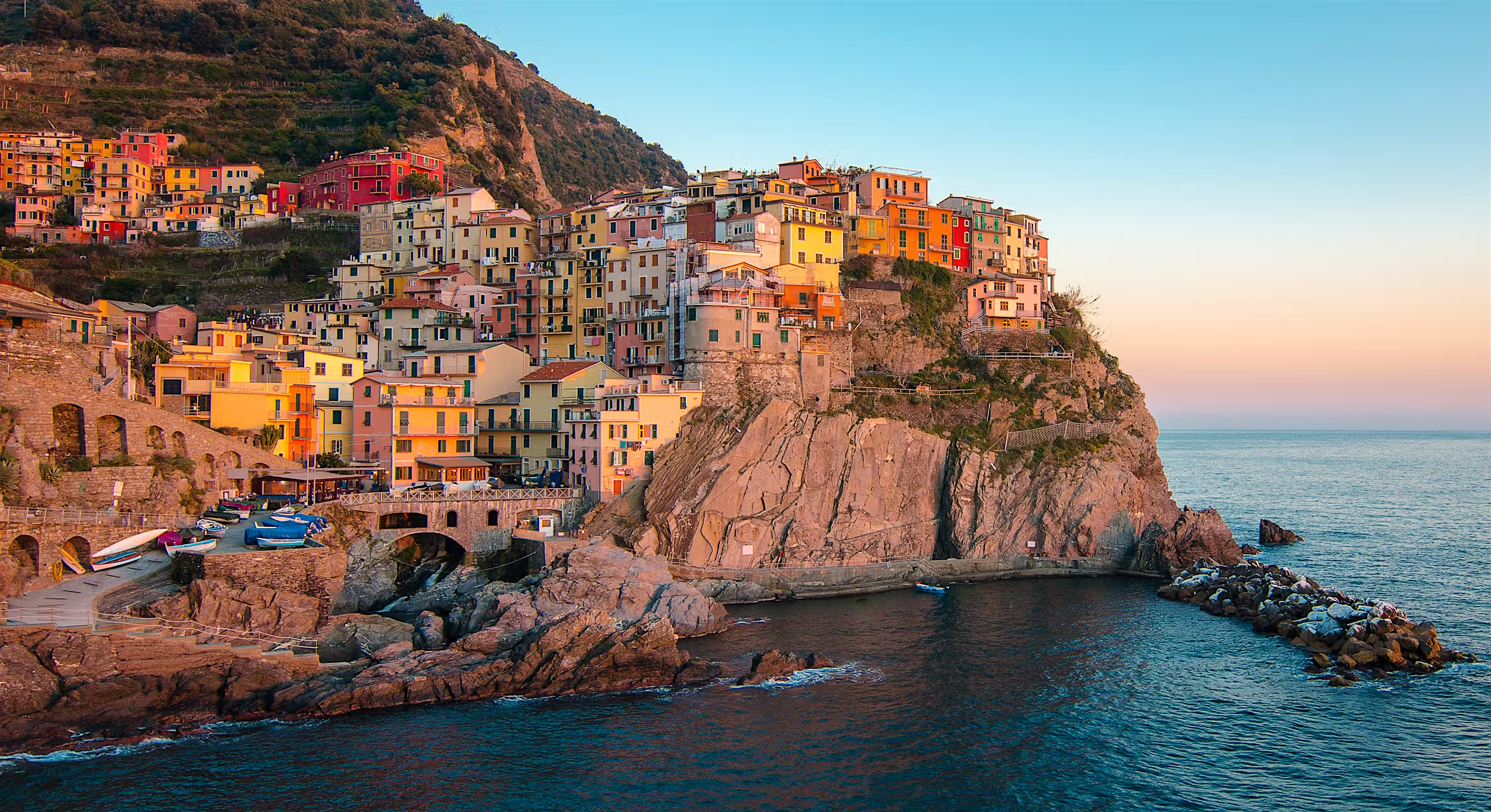
444.1075° N, 9.7361° E
- Italia
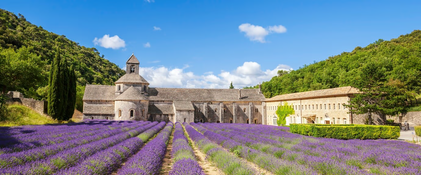
43.2965° N, 5.3698° E
- France

11.5564° N, 104.9282° E

68.2180° N, 13.6367° E
- Norway
The concept behind each Omodaka fragrance comes from observing the natural colors of the chosen locations. Each region inspires not only a scent but also specific shades that capture its essence. For example, Provence evokes lavender and golden tones, while the Lofoten Islands, with their snowy landscapes, inspire icy blues and pure whites. This approach allows each fragrance to reflect the atmosphere of the place, offering a visual and olfactory sensory journey.












The letter "O" is deformed to resemble a circle, symbolizing a perfume bottle or a container. In one of the variations, this "O" is positioned under a rectangle, representing a rim, from which sticks emerge, similar to those used for diffusing scents. This detail directly references the sensory experience and the art of perfuming spaces. The typography remains minimalist and elegant, creating a balance between modernity and refinement, while symbolizing the calming atmosphere and harmony the products bring to the home.


The packaging of Omodaka was designed to evoke serenity and elegance, in harmony with the essence of the brand. I chose a cubic shape for the box, symbolizing simplicity and balance, values deeply rooted in Japanese culture. This minimalist design is inspired by traditional Japanese elements, which highlight the beauty of simplicity and the harmony of shapes.
A band around the box adds a touch of sophistication while creating a sense of protection, reflecting the idea of refuge and calm that we wish to offer our users. The map of the location on the box pays tribute to the inspiring landscapes that guided the creation of each fragrance, allowing users to embark on a sensory journey. This map enhances immersion and the concept of escape to places filled with tranquility.
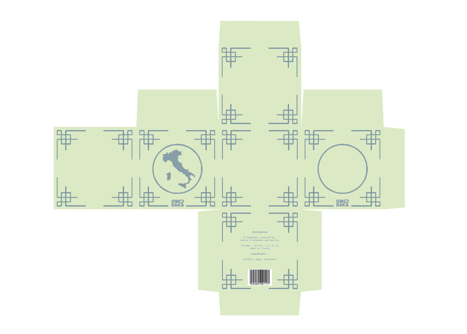
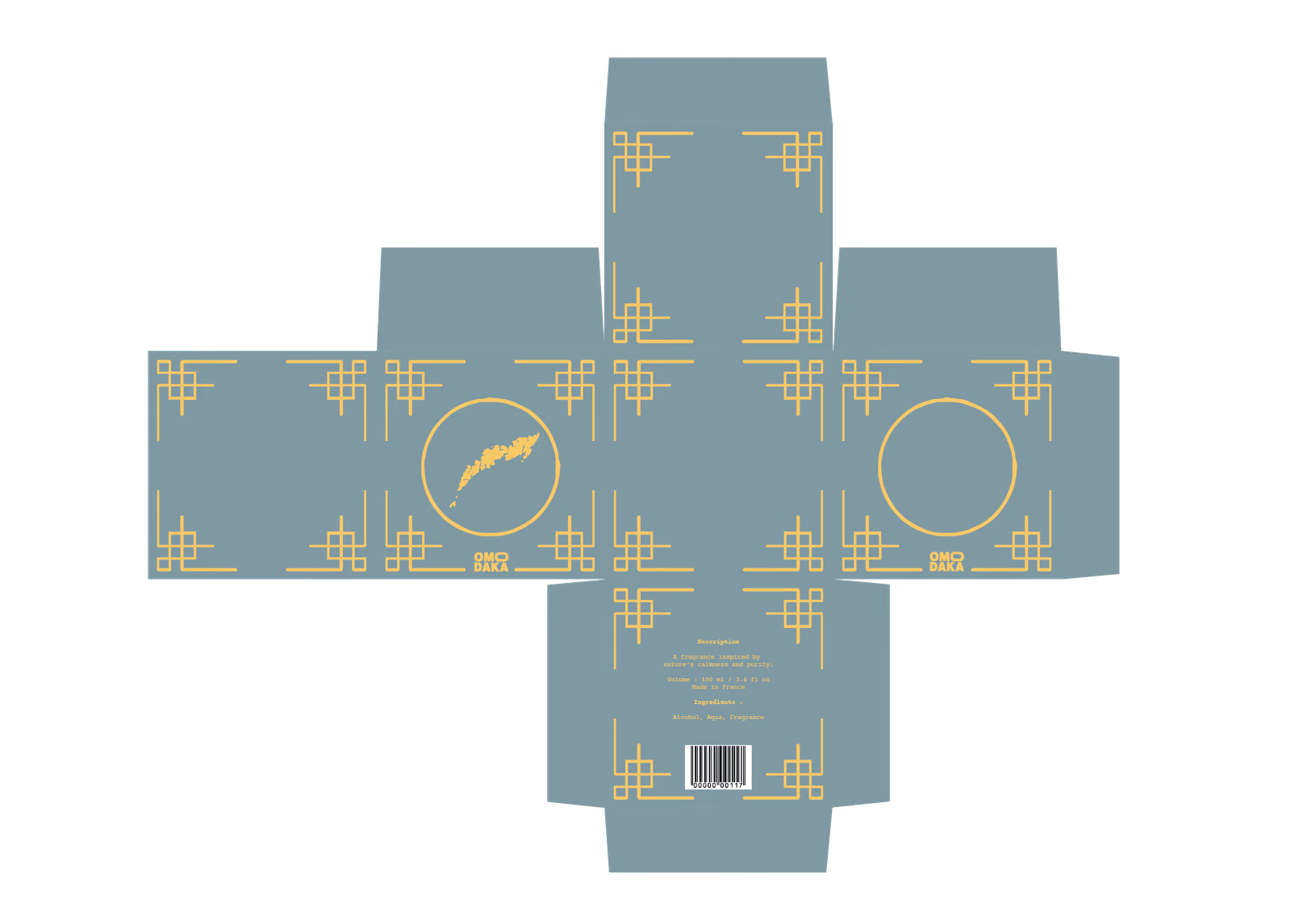
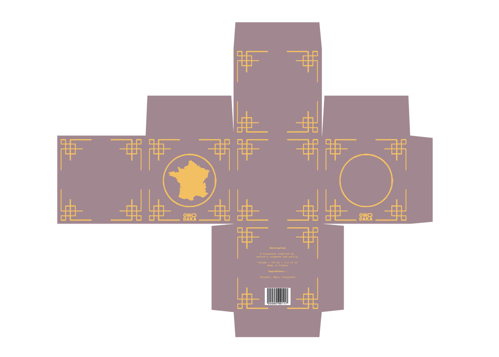
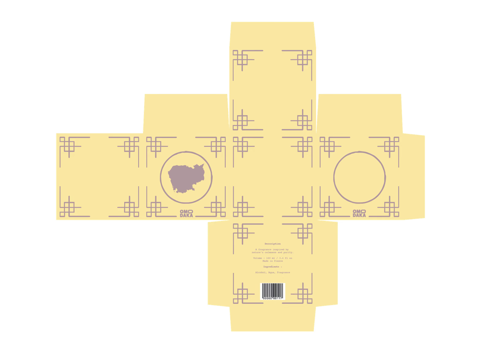




1.Main Box – The primary structure containing the product.
2.Perimeter Band – The band surrounding the box.
May this creation awaken your inspiration.